In the 5th part of this 8 part series, you’ll learn about the concept of “bleed”. This is to do with the edge of your cards, when they are cut to size. You could say this article is cutting edge!

  1. Introduction
  2. Card Sizes: things to consider
  3. Image Resolution
  4. Understanding Colour modes (CMYK vs RGB vs Pantone)
  5. Bleed and Trimyou are here
  6. Finishing Layers (Foil, flitter, emboss)
  7. Getting Files Press Ready Checklist
  8. Working with your Printer

Bleed

As we discussed in Part 2 (Card Sizes), greeting cards are printed in bulk on large sheets, and then cut down to size. Most printers use high precision guillotines, however there’s always a tolerance, a small margin of movement on the guillotines. This movement can be less than a couple of millimetres, but you still need to plan for it.

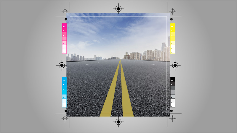
To allow for this margin of error, card designs need to include “bleed”. This is when the design of the card overshoots the line at which the trim will take place. This ensures that the cut of the guillotine results in the design going to the edge of the card, and can be forgiven for minor deviations.

Most printers ask for 3mm of bleed. This mean you add 3mm to each edge of your card, knowing that it will be cut away. So if you card is 150mm x 150mm when folded, the flat size will be 300mm x 150mm. The actual image size you supply will be 306mm x 156mm. The printer will cut away the extra 3mm on all four sides to ensure your image reaches the edge as intended.

Without bleed, you could end up with unsightly and uneven white borders around one or more edges of the card.

The Fold

It’s worth mentioning at this point that you also need to consider the crease/fold of your card in relation to the image on the front (assuming your card is not just the same image or colour carrying over from the front to the back). Just as you don’t want a white line to appear around the outside of the card, you also don’t want one to appear on the edge of the card closest to the fold. For this reason, the image on the front should extend 1mm to 2mm past where the crease will be placed for the fold.

While we’re on the subject of the fold, it’s good practice to put the fold very slightly off centre, so that the front of the card, protrudes over the back of the card when folded. The difference only needs to be 1mm or so, and it helps the recipient of the card open it easily with their thumb.

Quiet Zone

Making allowances for the tolerance of the guillotines also applies to the text or other pertinent attributes of your design. Just as the cut can land slightly outside where it’s supposed to, it can also land slightly inside too. And that means if you have text close to the edge, you risk it being cut into.

For this reason, it’s good practice to observe a minimum 5mm “quiet zone”, an area of the card where no text is placed. In the image below, the text on the right risks being cut into because it’s too close to the edge.

Latest updates from the GCA